Women's Tracksuits
(23 Results)Time Out
You can select up to 3 products


L. SHERPA LEGACY TRACKSUIT high visibility - Coordinated tracksuit - Women's
US$189.00
US$290.00
Coordinated tracksuit - Women's
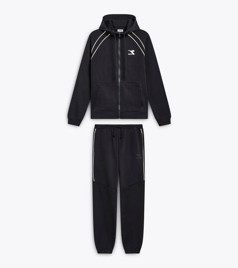
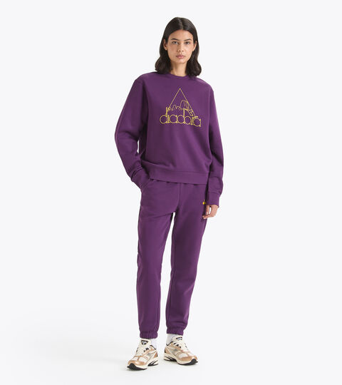
L. LEGACY TRACKSUIT black - Lifestyle tracksuit - Comfort fit - Made in Italy - Women
US$268.00
US$310.00
Lifestyle tracksuit - Comfort fit - Made in Italy - Women
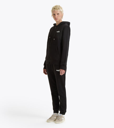
L. FULL-ZIP HOODIE LOGO TRACKSUIT black - Coordinated tracksuit - Women's
US$92.50
US$112.00
Coordinated tracksuit - Women's

L. HALF ZIP SWEATSHIRT LEGACY TRACKSUIT white alyssum - Coordinated tracksuit - Women's
US$126.00
US$210.00
Coordinated tracksuit - Women's

L. HALF ZIP SWEATSHIRT LEGACY TRACKSUIT blue denim - Coordinated tracksuit - Women's
US$126.00
US$210.00
Coordinated tracksuit - Women's
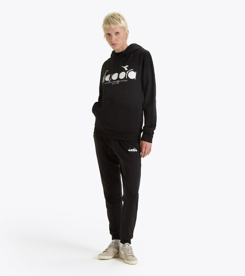
L. HOODIE LOGO TRACKSUIT black - Coordinated tracksuit - Women's
US$107.00
Coordinated tracksuit - Women's
L. FULL-ZIP HOODIE LOGO TRACKSUIT aventurine - Coordinated tracksuit - Women's
US$71.90
US$112.00
Coordinated tracksuit - Women's

L. SWEATSHIRT ROUTE TRACKSUIT black - Coordinated tracksuit - Women's
US$87.50
US$125.00
Coordinated tracksuit - Women's

L. SHERPA LEGACY TRACKSUIT blue denim - Coordinated tracksuit - Women's
US$189.00
US$290.00
Coordinated tracksuit - Women's

L. SWEATSHIRT ROUTE TRACKSUIT blue denim - Coordinated tracksuit - Women's
US$87.50
US$125.00
Coordinated tracksuit - Women's
L. LEGACY TRACKSUIT whisper white - Lifestyle tracksuit - Comfort fit - Made in Italy - Women
US$268.00
US$310.00
Lifestyle tracksuit - Comfort fit - Made in Italy - Women
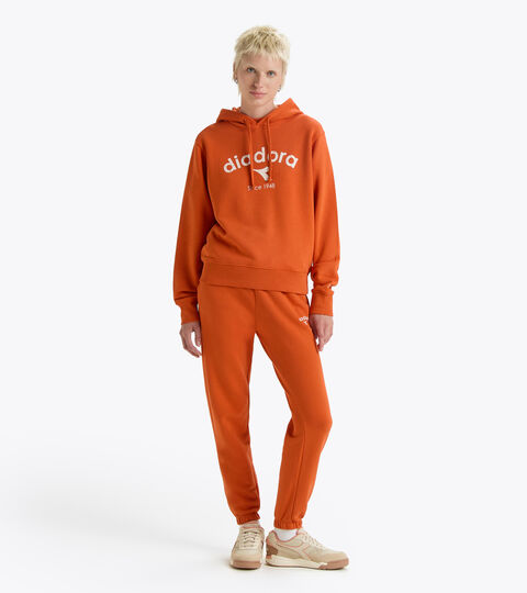
L. HOODIE ATHLETIC LOGO TRACKSUIT pureed pumpkin - Coordinated tracksuit - Women's
US$58.50
US$117.00
Coordinated tracksuit - Women's
L. SWEATSHIRT ATHLETIC LOGO TRACKSUIT pureed pumpkin - Coordinated tracksuit - Women's
US$56.00
US$112.00
Coordinated tracksuit - Women's
L. HOODIE ATHLETIC LOGO TRACKSUIT classic navy - Coordinated tracksuit - Women's
US$85.40
US$122.00
Coordinated tracksuit - Women's
L. SWEATSHIRT ROUTE TRACKSUIT violet jewel - Coordinated tracksuit - Women's
US$81.00
US$125.00
Coordinated tracksuit - Women's
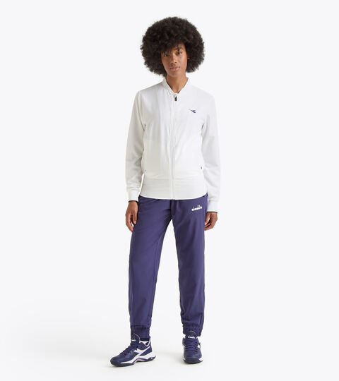
L. TENNIS TRACKSUIT - Coordinated tracksuit - Women's
US$112.00
US$160.00
Coordinated tracksuit - Women's
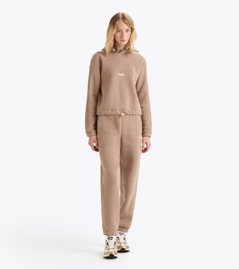
L. SWEATSHIRT ATHLETIC LOGO TRACKSUIT light brown hazelnut - Coordinated tracksuit - Women's
US$67.20
US$112.00
Coordinated tracksuit - Women's
L. HOODIE ATHLETIC LOGO TRACKSUIT light brown hazelnut - Coordinated tracksuit - Women's
US$70.20
US$117.00
Coordinated tracksuit - Women's

L. SWEATSHIRT ROUTE TRACKSUIT white alyssum - Coordinated tracksuit - Women's
US$81.50
US$125.00
Coordinated tracksuit - Women's
L. HOODIE ATHLETIC LOGO TRACKSUIT light brown hazelnut - Coordinated tracksuit - Women's
US$73.20
US$122.00
Coordinated tracksuit - Women's
Page no.
of 1
Women's Tracksuits and Dresses
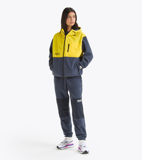
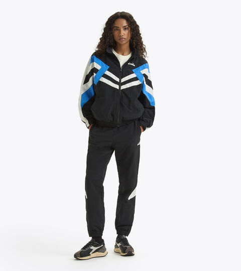
Tracksuits are a comfortable and versatile item that no woman's wardrobe should be without. Suited to almost any sports or informal setting – at home or outdoors – Diadora women's tracksuits are the perfect outfit for modern, dynamic women. Discover our collection today and complete your outfit with women's shoes from the Sportswear, Heritage or Running collections. Fashions fade, tracksuits remain. Whether you wear them for sport or just lounging on the sofa at home, women's tracksuits have always provided comfort and softness. When they also feature special touches and are available in a range of attractive colours, they become a pleasure to wear, even when you're relaxing and enjoying your leisure time. Made of high quality fabrics with meticulous workmanship, Diadora's women's tracksuits and dresses enhance the female body, ensuring ease of movement on every occasion. Try wearing them to go walking or running, for yoga, at the gym or to change into after sport. You won't regret it. Looking for something to match one half of a tracksuit you already own? Look in our Women's trousers and Women's Jackets sections.
Log in to your profile
Save your addresses and payment methods, review your orders and manage your wish list.
Or log in via
Join the Diadora Club
Register to discover all the advantages reserved for registered users:
Register